Project Sunshine visual branding
Logo. Project Sunshine is a 501(c)(3) that trains volunteers to play, lead activities and socialize with pediatric hospital patients, which has been proven to accelerate recovery. Project Sunshine’s original logo had a hand-drawn, childlike appearance. Their marketing director asked me to design something more sophisticated that aligned with their brand positioning - friendly, bright and playful, yet professional and trustworthy. The logo I designed checked all the boxes, plus it gave them a bright, warm color palette, a font family available in both print and web versions, and elements that can be utilized across applications. The logo can work in one color (a basic requirement that is, surprisingly, often ignored) and is readable at small sizes. This was one of the first options I presented to the marketing committee, made up of board members and industry experts from companies such as PepsiCo and Pinterest.
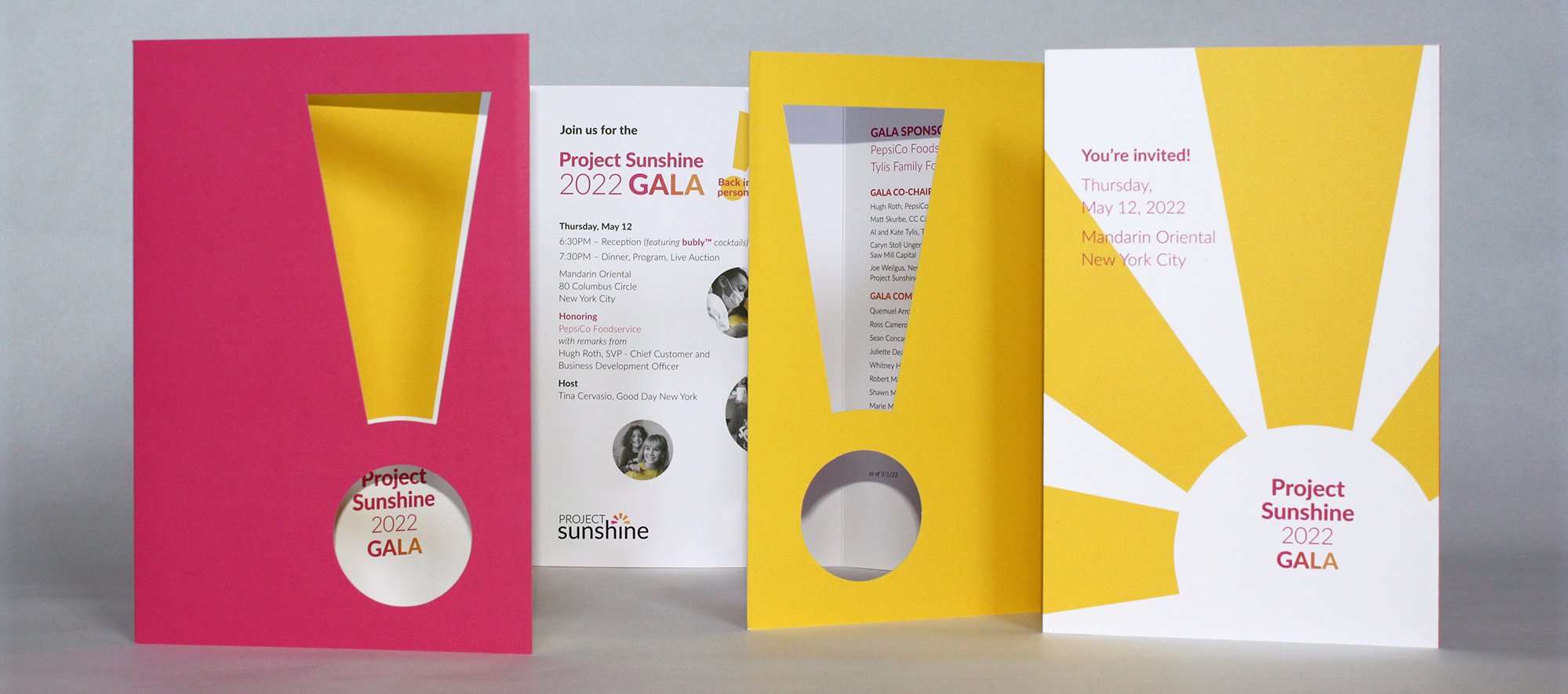
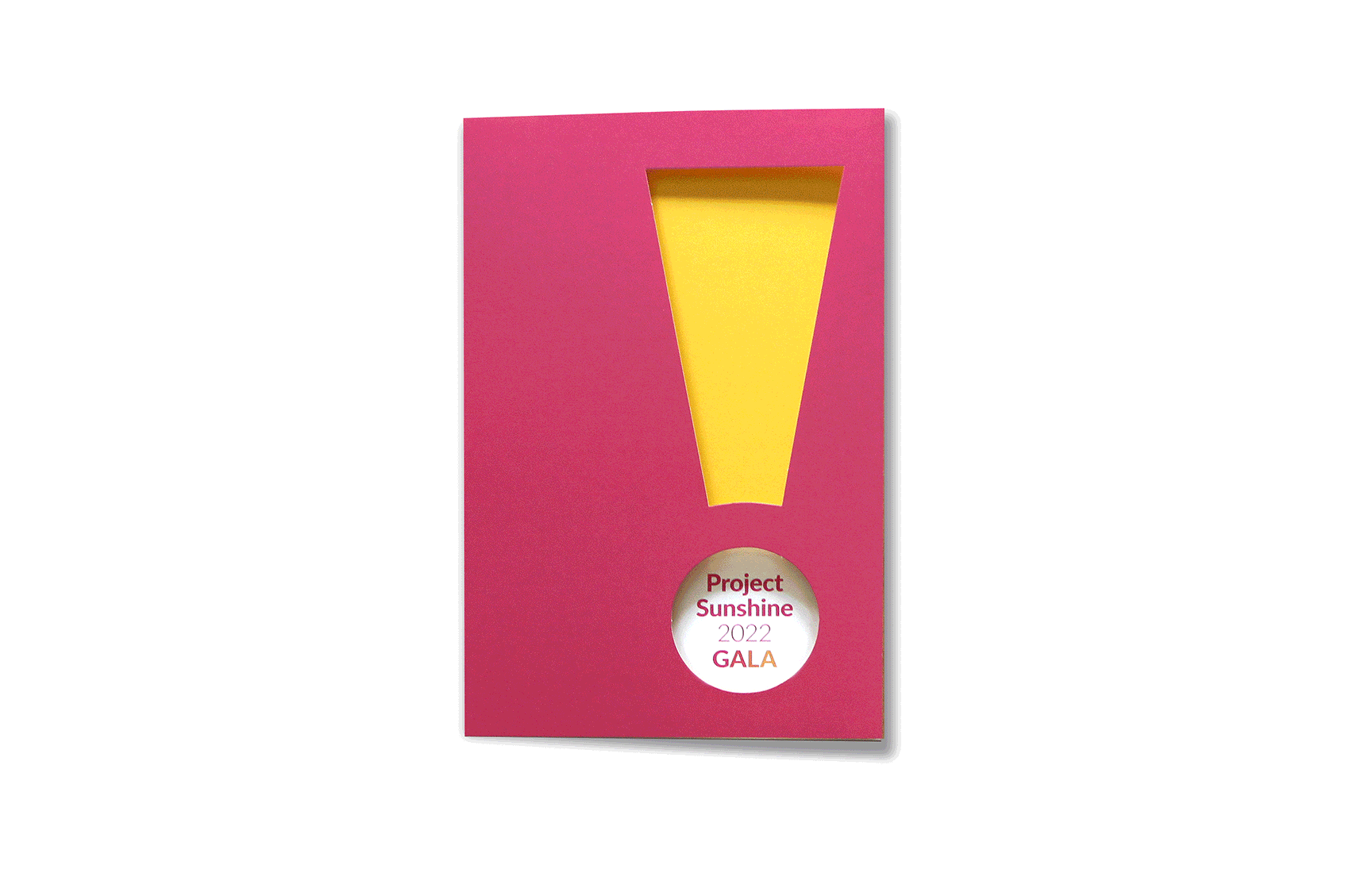
Gala invitation. The first application of Project Sunshine’s new brand was to their Gala invitation. The event was held at the Mandarin Oriental in NYC and would unveil the new look to supporters. The shape of the rays reminded the marketing director of exclamation points. I decided a die cut in that shape would be a fun and unexpected way to “reveal” the rest of the 3-panel gatefold invitation. The invitation showcases the sunshine yellow of Project Sunshine’s iconic volunteer tee shirts. On the interior, the photos are black and white except for the yellow tees - highlighting the familiar in the midst of the new. The mailing was a hit, and I like to think it played a part in the impressive funds raised at the gala.
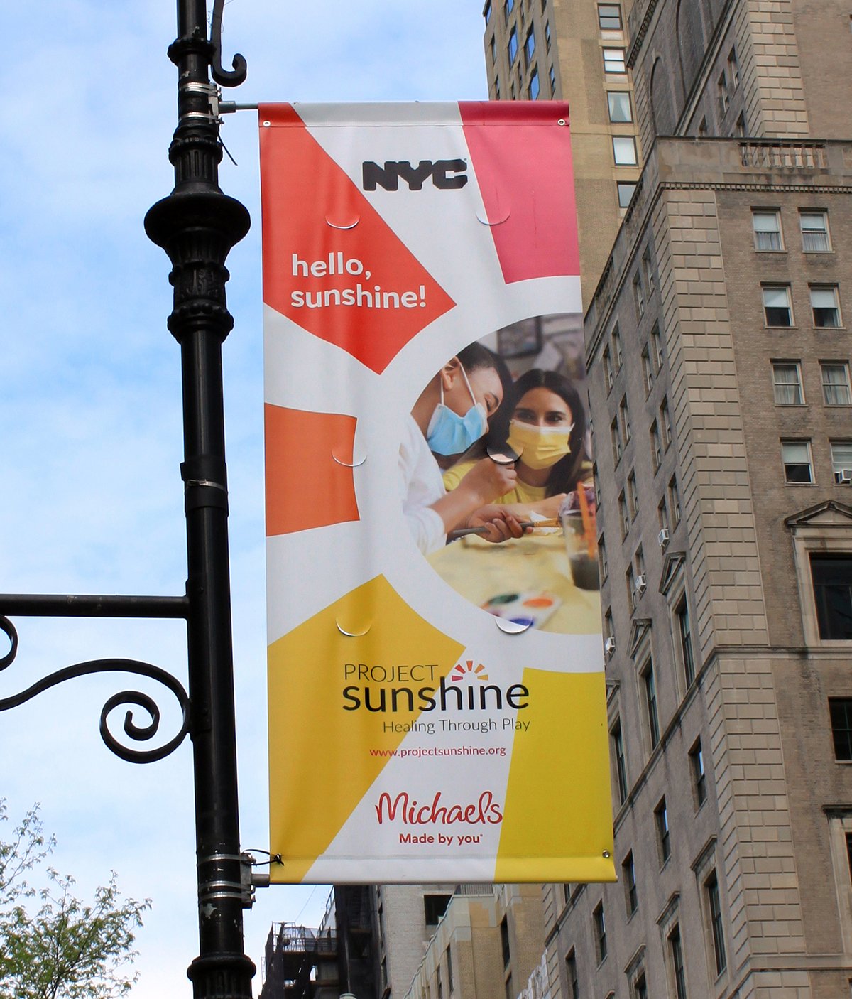
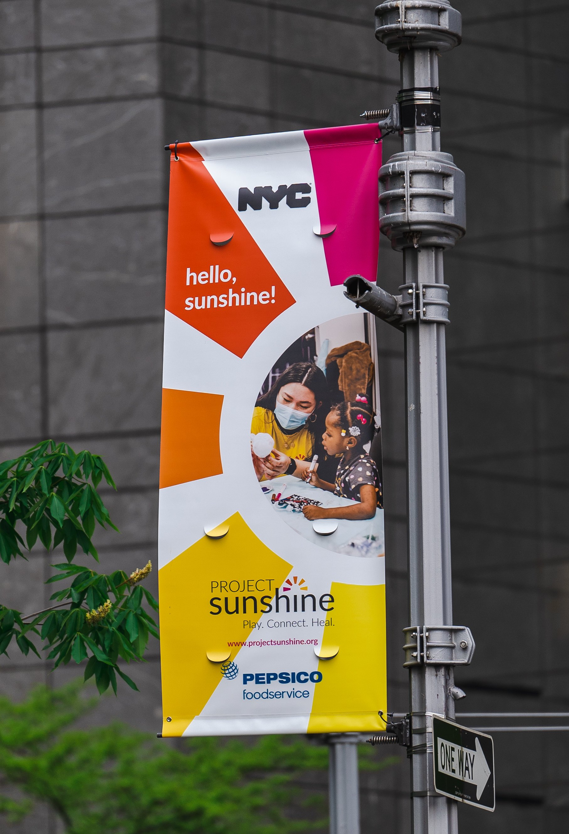
NYC street banners. In NYC, street banners can be used to promote a local event or non-profit, but not a corporation. To raise money and promote their organization leading up to their benefit gala, Project Sunshine partnered with several corporations, including Michael’s, Pepsi, NBC Universal and Salesforce, who were then able to display their logos in the lower section. The new brand is front and center, the sunbeams acting as eye-catching graphic elements. I chose close-up photos that depicted a volunteer and child and contained a lot of the PS signature yellow. The banners were hung from streetlights in the Columbus Circle area and brightened the streets just as spring took hold in the city.

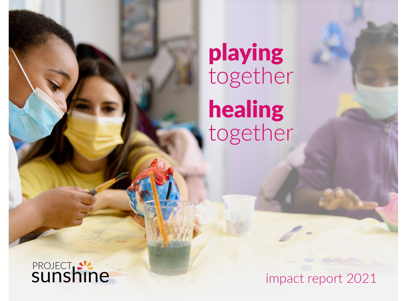
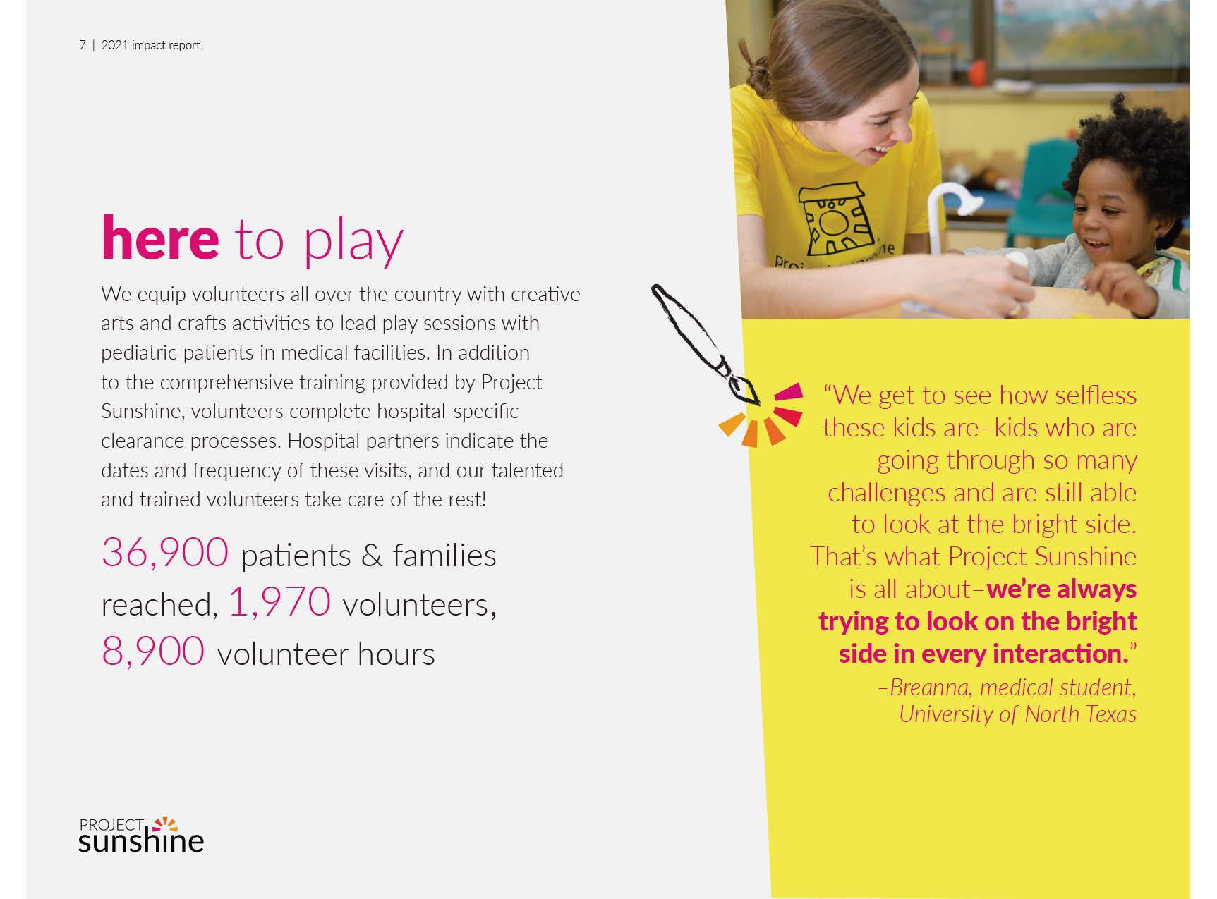
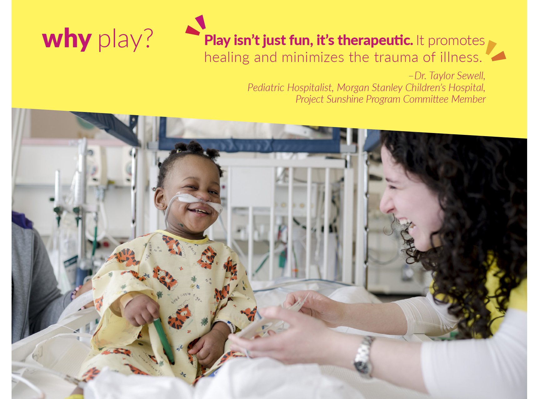
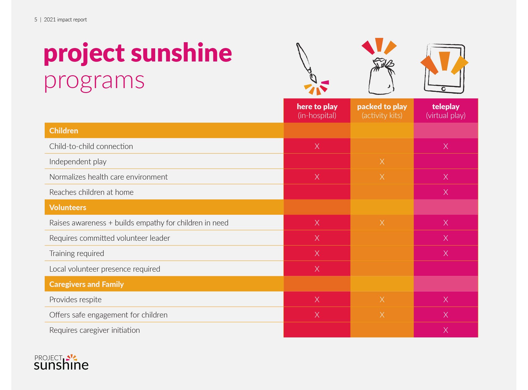
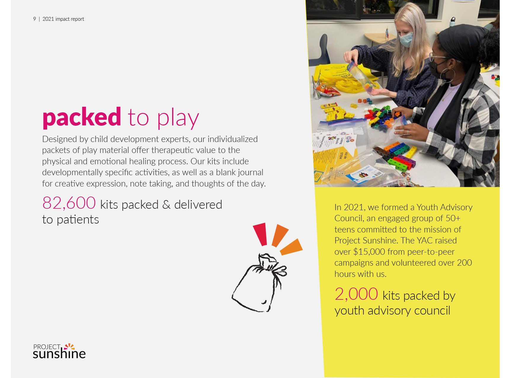
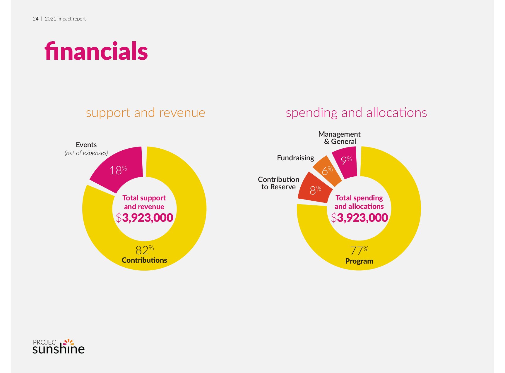
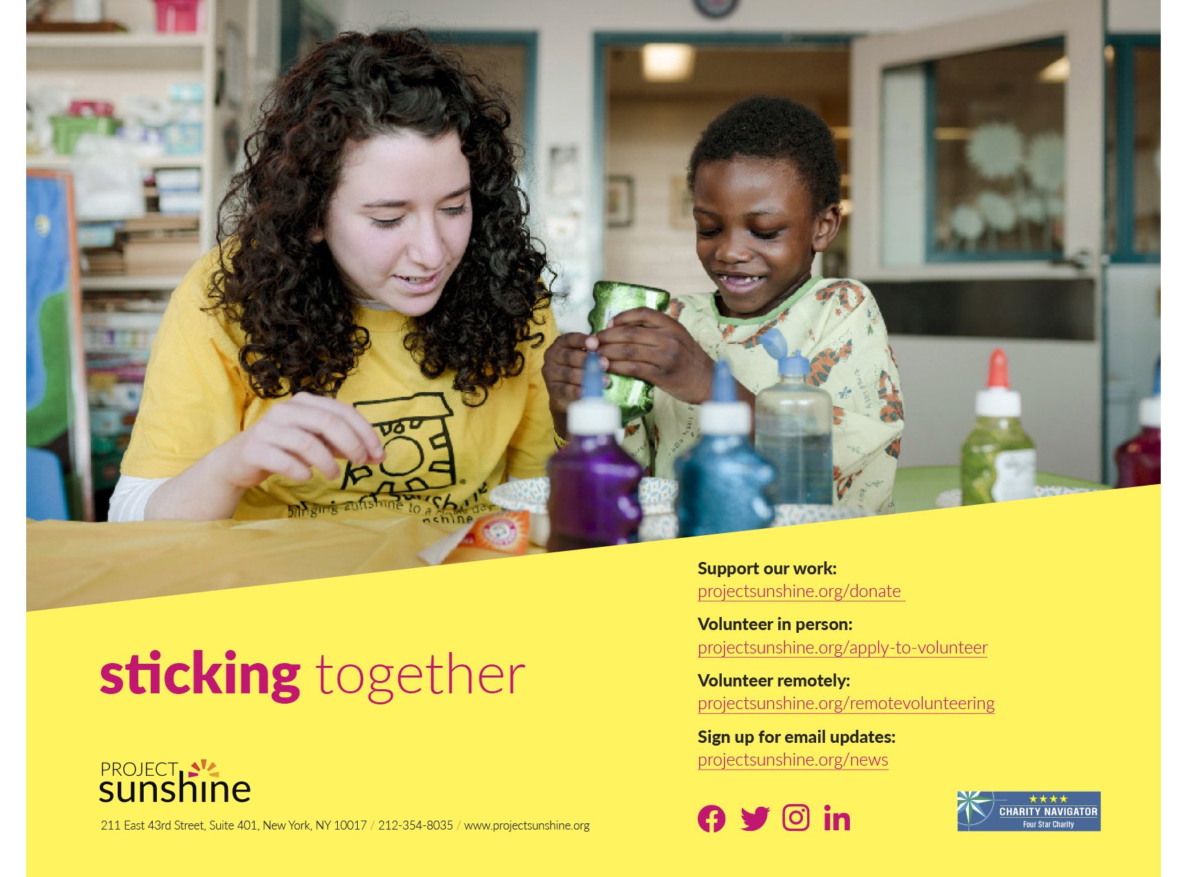
Annual report. Project Sunshine and I were excited about creating an “impact report” to showcase their new brand identity. I used large, angled sidebars in their signature yellow to highlight quotes and photos. The playful angles mirror the slant of the sunbeams in the logo. Lower case titles echo the wordmark, and I created whimsical drawings to sprinkle throughout. Click here to view the full 2021 report.
2022 Annual Report: