
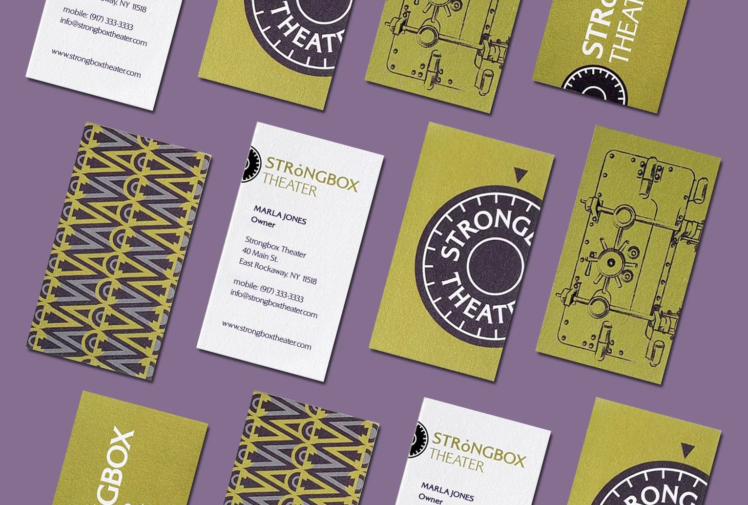
Logo and business cards. This small theater in East Rockaway, NY is in a former bank built in the 1920s. When I was asked to design their logo, there was really nothing from which to build the brand - the theater has yet to host its first performance. It was purchased in what we all hoped was the middle of the Covid pandemic. Ensuing supply-chain issues, combined with the complexity of transforming a bank into a theater/bar/restaurant, means they won’t open until 2026. Using the elegant old structure, abandoned vault and antique safe deposit boxes as inspiration, I presented 20 logo concepts. The version the client chose evokes the 19th century, theater and banking. The wordmark, with the tick over the “o,” can be used alone or in combination with the symbol.
During the exploration process, I developed patterns and illustrations that could work as elements on menus, programs, even carpet, and included some on the reverse sides of their business cards.
Strongbox has received favorable attention in NY Newsday, on CBS New York and in local media and has produced three off-premises theater festivals.


Website. A photo I took of the building interior forms the background of the Strongbox home page, creating a slightly mysterious, anticipatory feel. What will happen when we open the door? The site is built on the Squarespace platform, so can be easily changed and updated by the client. Once the theater opens, hidden links in the navigation such as Calendar and Merchandise can be activated. Website: www.strongboxtheater.com (Warning: Client-maintained!)


Entrance Rendering. Theater design: Think Architecture + Design


Poster. “A Festival of Stage and Song” was Strongbox’s second outdoor production - a group of diverse, locally written, one-act plays. I created a mostly typographical design and altered existing fonts to give them a handmade, carnival quality. The colors and illustration evoke the feel of a summer evening and reinforce the brand. Repurposed for ads in NY Newsday and other local papers, programs, billboards and additional promotional materials.


